
Crafting Tactile Luxury with Curated Material Palettes
We dive into curated material palettes for tactile luxury interiors, exploring how stone, timber, metals, glass, and textiles interplay to create comfort you can feel. Expect practical frameworks, intimate stories from real projects, and honest guidance on pairing finishes, tuning light, and honoring provenance. Share your favorite combinations in the comments and subscribe for future palettes you can test at home and adapt to your own rooms.
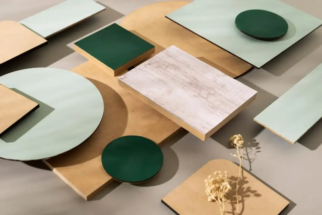
Sensing Quality: The Foundations of a Palette
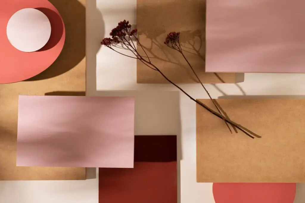
Luxury you can touch begins with intention. A coherent palette flows from tactile contrasts, restrained color, and disciplined repetition across rooms. By editing materials to a few expressive heroes and supportive companions, you heighten harmony, simplify detailing, and let craftsmanship sing. This approach steadies budgets, accelerates decisions, and prevents visual noise that dulls emotional impact.
Grain, Vein, and Hand
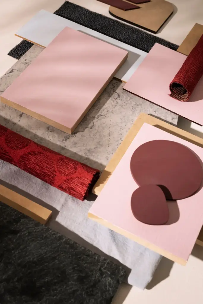
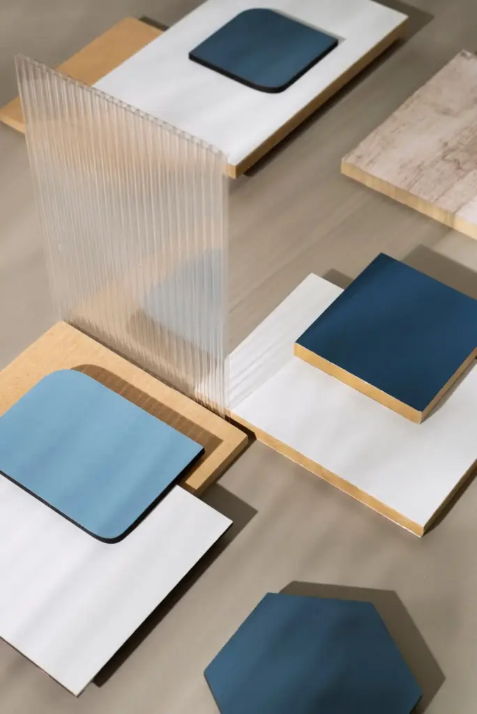
Start by reading the material like a story. Trace the soft veining in limestone, the cathedral grain in quarter-sawn oak, and the looped texture of bouclé. These cues guide pairings that feel inevitable rather than forced. Combine one assertive pattern with quieter neighbors, allowing hand-feel and movement to gently lead the composition without shouting.
Scale and Proportion in Material Blocks
Tile size, plank width, and slab thickness shape perception as much as color. Larger formats calm busy patterns, while finer joints can create rhythm without clutter. Repeat a plank width in cabinetry reveals or a stone thickness at thresholds, and coherence appears. When scale aligns, rooms feel resolved, honest, and gracious under both daylight and lamplight.
Quiet Details That Signal Luxury
Invisible elegance lives in edges and junctions. Shadow gaps, flush transitions, aligned grains, and continuous stone veins across miters whisper confidence. Specifying solid metal trims rather than plated pieces, or hand-burnished plaster corners rather than bead, creates a soft echo of care. The hand notices these subtleties before the eye names them, building trust and calm.
Certifications Without Compromise
Seek verifiable standards to protect air, forests, and communities. FSC and PEFC guide timber choices, Greenguard and Declare labels flag low-emitting products, and ISO-backed quarry practices ensure stewardship. These markers do not diminish luxury; they sharpen it. Beautiful materials that treat makers and habitats well bring a clarity of feeling that purely decorative choices never match.
Storytelling Through Origin
A dining table in storm-felled oak carries seasons of weather within its grain. Hand-pressed zellige from a coastal atelier holds the rhythm of human touch in every imperfect edge. When clients hear these stories, they slow down, reach out, and care more. Share origins in your project notes, and watch how conversation, pride, and stewardship naturally grow.
Local First, Global Perspective

Exploring nearby stone yards, heritage brickworks, and regional mills reduces transport and strengthens context. Pair local anchors with considered global highlights for contrast and depth. A domestic limestone floor with a small insertion of Italian bronze can sing. Ask readers to recommend artisans in their city, and together build a living map of responsible, soulful sources.
Light, Color, and Surface Interactions
Materials reveal different personalities under changing light. Warm LEDs at 2700–3000K flatter walnut, while daylight emphasizes the cool clarity of honed marble. High-CRI sources unlock true color in textiles and finishes. Test combinations at dawn and dusk, then adjust sheen levels, undertones, and joint colors. With light tuned properly, the palette breathes, softens, and endures elegantly.
Layering Hard and Soft for Sensory Balance
Hard surfaces establish architecture; soft layers complete hospitality. A cool stone hearth warms with mohair and linen, while patinated metal hardware bridges hand to material with reassuring weight. By sequencing tactile contrasts, you guide movement and rest. Invite readers to trace a journey through their home, noting moments that deserve softness, glow, or grounding density.
Textile Pairings That Calm Stone
Against travertine or terrazzo, dense wool rugs absorb echo and invite bare feet. Linen drapery filters glare and coaxes stone colors into harmony. Throw blankets in cashmere or alpaca soften edges, while bouclé upholstery anchors seating without slickness. Share favorite mills, weights, and weave structures in the comments so others can build comforting, enduring textile libraries.
Metal Accents That Warm Cool Palettes
Brass, bronze, and aged nickel introduce a human glow beside marble, glass, and concrete. Choose solid pieces with tactile edges and comfortable temperatures to the touch. A knurled grip, a cast pull, a hand-burnished lip makes interaction memorable. Readers can vote on preferred patinas and finishes, helping refine a collective index of metals that age beautifully.
Acoustic Comfort Without Compromise
Quiet is part of luxury. Layer rugs, felt-backed panels, and upholstered wall sections to temper reverberation from stone floors or plaster walls. Choose textiles with density rather than thickness alone, and coordinate underlays with door thresholds. Share listening impressions before and after changes, and gather measurement tips so future projects align haptics with serenity and conversation-friendly sound.
From Concept to Space: Stories of Material Alchemy
Real rooms teach best. These vignettes show how a disciplined palette becomes atmosphere, routine, and affection. Each example reveals decisions about thicknesses, finishes, and edges, plus small improvisations that saved budgets without sacrificing touch. Use the stories as prompts, then comment with your own successes, missteps, and unexpected pairings that became household favorites over time.
Care, Patina, and Longevity
True luxury matures rather than decays. Oiled timbers invite seasonal maintenance that becomes ritual, while waxed stones earn gentle sheen where hands rest. Avoid brittle finishes that fear scratches; choose systems that accept repair and character. Share maintenance routines, favorite products, and lessons learned, so collective wisdom turns small habits into decades of calm, grounded beauty.
Finishes That Age Gracefully
Hardwax oils, breathable sealers, and mineral paints allow materials to exchange moisture and develop depth. They can be renewed locally, unlike plastic films that peel. Embrace patina on bronze and leather rather than polishing it away. Record how surfaces change each season, then adjust care strategies accordingly. This relationship, honest and attentive, makes spaces feel alive and welcoming.
Daily Rituals for Lasting Beauty
Place coasters near favorite chairs, keep pH-neutral cleaners under the sink, and set felt pads beneath small sculptures. Quick passes with a soft brush lift grit before it scratches. Weekly oil soap on oiled oak restores glow. Encourage readers to publish their checklists and favorite cloths, building a shared kit that transforms chores into satisfying, mindful rituals.
All Rights Reserved.