
Sculpting Depth with Light: Revealing Grain, Texture, and Character
Seeing Texture Before You Switch On

Raking Light That Carves Form
Position a narrow-beam source low to the plane to create raking illumination that exaggerates relief just enough to articulate tactile detail. Watch for micro-shadows forming along grooves and fibers, then tune distance to manage falloff. Too close may overemphasize imperfections; too far can flatten nuance. Find the sweet spot where texture emerges confidently, highlights stay honest, and the material’s inherent personality reads without feeling forced or distractingly theatrical.
Cross-Light for Balanced Relief
After establishing a raking key, add a gentler cross-light to restore midtones lost to deep shadows. This secondary angle should be softer and broader, lifting texture without erasing it. By balancing the directional cue with a complementary fill, you maintain depth while smoothing harsh transitions. The result is refined legibility: grain remains dimensional, shadow detail returns, and viewers sense the surface’s true contour without guessing in overly contrasted regions.
Feathered Edges, Controlled Spill
Feathering places the beam’s softer edge on the subject, yielding graceful gradients that flatter complex surfaces. Tilt the modifier so only the beam’s shoulder meets your target, and flag excess spill to protect backgrounds. This technique offers nuanced control, maintaining separation and guiding attention along depth contours. Carefully feathered light supports delicate materials, keeps speculars polished rather than harsh, and helps your composition read as intentional, clean, and emotionally inviting.
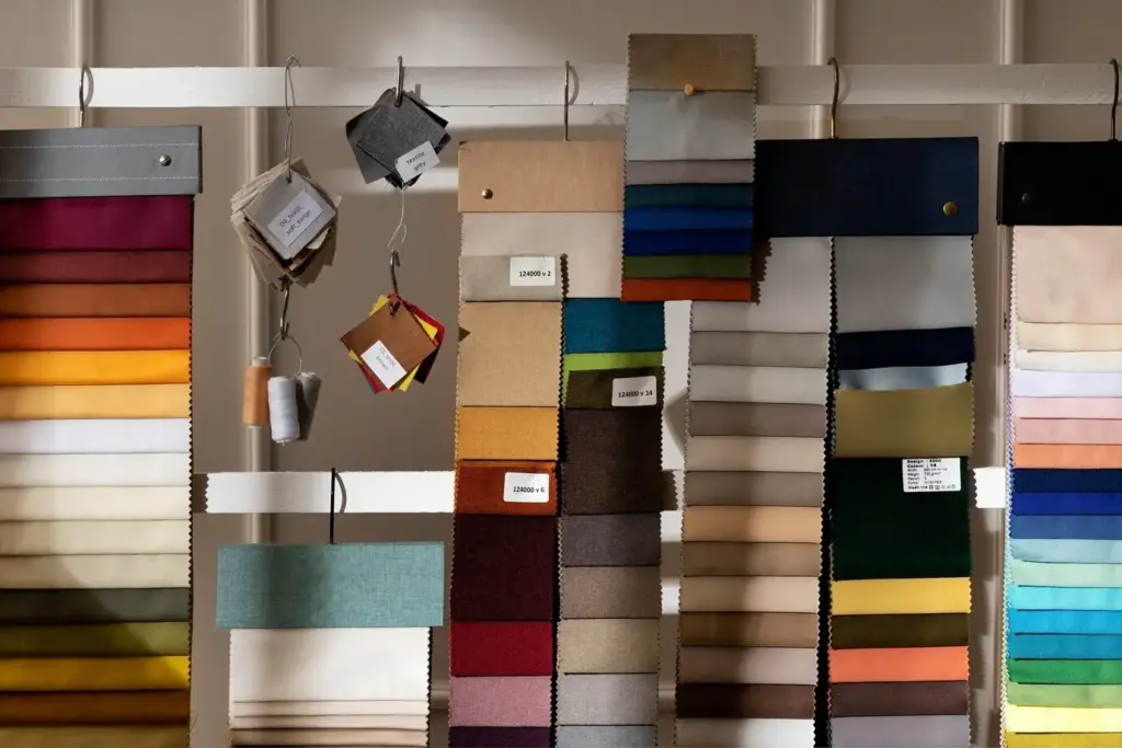
Color, Spectrum, and Material Honesty
Grids, Barn Doors, and Flags
Honeycomb grids restrain beam spread, maintaining contrast along grooves while avoiding contamination elsewhere. Barn doors shape edges for practical containment, and flags isolate surfaces, protecting backgrounds or neighboring materials. Together, these tools refine shadow geometry, keep specular highlights intentional, and maintain a crisp reading of relief. They also reduce post-production cleanup, allowing texture to shine through naturally rather than being rescued by heavy-handed masking or contrast adjustments later.
Soft Sources, Hard Accents
Combine a generous softbox or scrim as the main sculptor with a small, punchy accent to place sparkling micro-highlights. This duet creates dimensional separation while keeping transitions elegant. The soft source nurtures midtone detail, and the hard accent clarifies edges of grain or stitch, offering visual rhythm. Keep the accent subtle; its job is to animate texture, not overpower it. Fine-tune distance and output until sparkle feels alive yet believable.
Gobos, Cookies, and Texture Projection
Projecting patterns across a surface can reinforce directionality, suggesting sunlight through blinds or foliage that moves with storytelling purpose. Use gobos to introduce gentle variations that kiss the grain rather than obscure it. Keep densities light and movement controlled, prioritizing legibility. When executed carefully, these overlays enrich the narrative, guide the eye along relief, and establish atmosphere without stealing the spotlight from the material’s distinctive, hard-earned character and tactile signal.
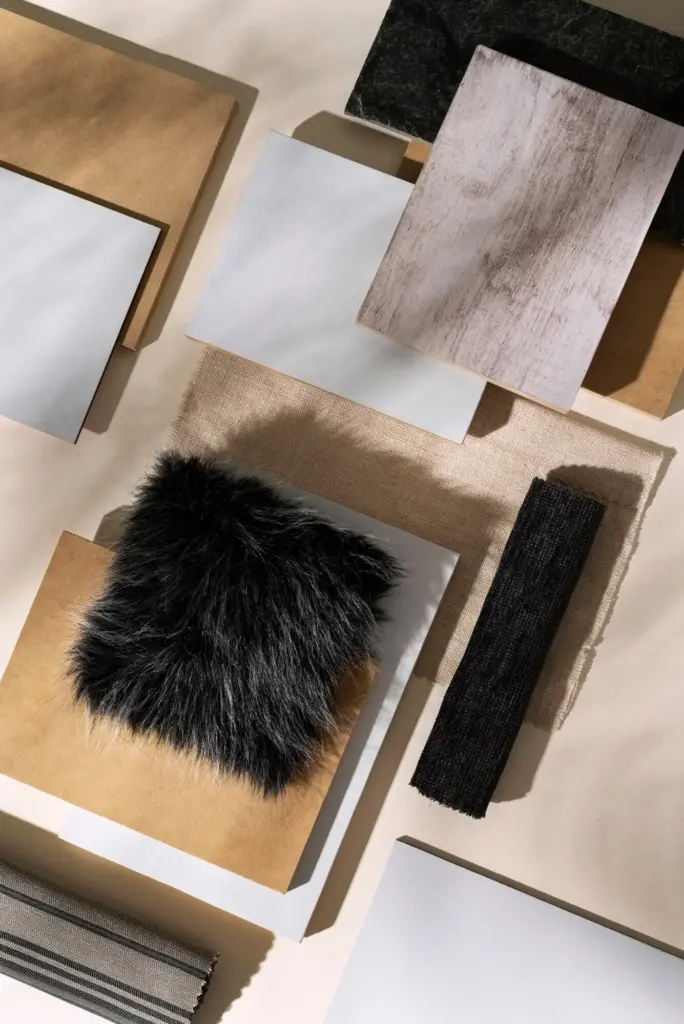
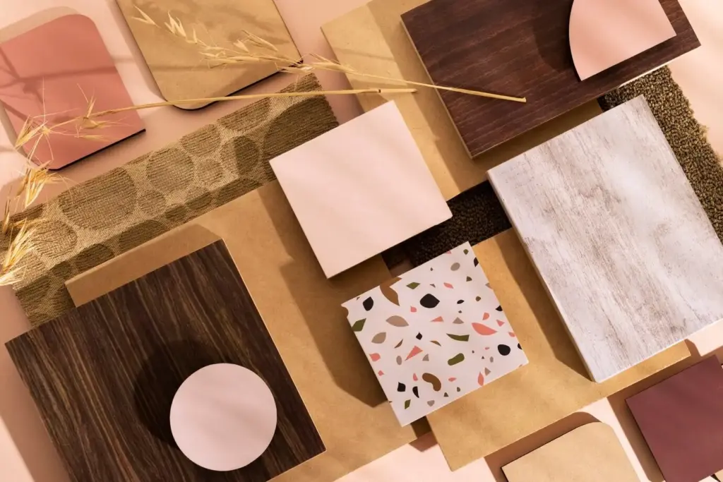
Case Studies Across Wood, Stone, and Fabric

Workflow, Measurement, and Iteration
Try It Yourself and Share Results
A Weekend Exercise You Can Repeat
Set up a single light, then add one modifier at a time: grid, diffusion, or flag. Capture frames after each change, noting angle and distance. Finally, introduce a small hard accent to watch micro-speculars animate grain. Repeat on different materials. This incremental approach clarifies cause and effect, accelerating intuition about how light sculpts depth and reveals character, even in tight spaces with modest equipment and unpredictable ambient conditions.
Capture Notes That Actually Help
Use a simple template: distance, angle, modifier, output, color temperature, metering, and subjective impression. Include a thumbnail of the setup. These notes turn experimentation into a library you can reference when deadlines loom. Patterns will emerge, highlighting reliable tactics for specific materials. Over time, you will move faster, make fewer mistakes, and achieve consistent depth portrayal that clients and collaborators recognize as intentional, informed, and beautifully controlled.
All Rights Reserved.